“Sacred Spaces” Exhibition at Leatherhead Theatre – KAOS (Kingston Artists’ Open Studios)
April 22, 2014
Art Journal of Jenny Meehan 2014 Post

- Sacred Spaces Art Exhibition at Leatherhead Theatre. Seven Artists from Kingston Artists’ Open Studios show work on the theme of contemplation and spirituality

Sacred Spaces Flyer by Jenny Meehan which promotes the Sacred Spaces Visual Art Exhibition at Leatherhead Theatre in May 2014 organised on behalf of KAOS (Kingston Artists’ Open Studios)
“Sacred Spaces” – Free Art Exhibition, Open to All. Disabled Access. Children Welcome.
See this exciting and interesting collection of work by Kingston Artists’ Open Studio artists Chris Birch, Emily Limna, Jenny Meehan, Richard Tomlin, Derek Turner, Hilary Walker, and Jude Wild.
The exhibition is curated and organised by Jenny Meehan on behalf of Kingston Artists’ Open Studios. A varied mixture of 18 original paintings, drawings,cyanotype sun prints, and photography by seven professional artists is sure to delight and interest you. The title of the exhibition “Sacred Spaces” references the inner lives of the artists , the process of creating artworks, and evidence expressed physically in the artworks themselves. In our creation we bring body and substance from our own inner contemplation, reflection and response to life and all we experience, both internal and external.
“Sacred Spaces” runs from 2pm on Saturday 3rd May until Friday 30th May during normal theatre opening hours which are normally 10am – 4pm Tuesday – Saturdays, (sometimes until 10pm but check with theatre first , phone 01372 365141)
“Sacred Spaces” is located in the ground floor foyer at Leatherhead Theatre 7 Church Street Leatherhead Surrey KT22 8DN. Disabled access and toilet facilities. Coffee shop open 10am – 2pm and at other times subject to the performance schedule.
Visiting Information:
The Leatherhead Theatre
7, Church Street
LEATHERHEAD
Surrey
KT22 8DN
Tel: 01372 365141
Fax: 01372 365195
Accessible location – 5 mins from M25, Junction 9
5 minutes walk from Leatherhead British Rail Station.
Town centre location, close to local shops and restaurants.
Three car parks within a few minutes walk (free after 6pm)
Disabled places right outside the theatre.
At last, a short and sweet Journal entry arrives!
Come along and see the show. Nice coffee shops around Leatherhead, and it’s a restful kind of town, with very good walking places nearby.
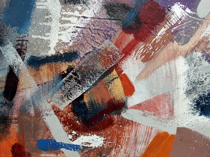
british modern abstraction lyric expressionpainting acrylic detail jenny meehan
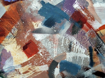
british modern abstraction lyric expressionpainting acrylic detail jenny meehan
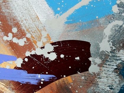
british modern abstraction lyric expressionpainting acrylic detail jenny meehan
How to Support Jenny Meehan
If you like my art working and would like to support me you can!
Just put
in your browser and follow instructions. There’s no option for me to thank you via the PayPal Me process but do contact me via contact form and let me know if you have gifted me so I can thank you.
You can buy my original paintings directly from me personally.
Just contact me via the contact form. Jenny Meehan/jennyjimjams – Art and Design – Contact Me
Sometimes they are offered for sale during exhibitions too. Normally its more expensive to buy them this way, (though not always). Some organisations enable me to price my work in an accessible way due to the way they operate, but if a submission fee is required I obviously have to factor it in.
I dislike this system, but art exhibitions are used to generate funds for different organisations and charging artists to submit artwork (to submit… Even if not accepted!) is one way this is done. There are also other costs incurred by the artist in supplying the artwork for exhibition. So artists artworks sold during an exhibition are frequently more expensive for an art collector to purchase. It is often preferable to approach an artist directly and view work by arrangement in person.
If you are thinking of buying one of my original paintings I can arrange a viewing for you. If you are looking for something specific in terms of colour and/or style, just let me know because I have many more paintings than I am able to display online. I can send you further information on the process of buying artwork directly from me if you would find that helpful. I appreciate that it is unfamiliar ground for many people.
Also available via redbubble, the well known print on demand marketplace, you can buy unsigned prints on many substrates. This is an easy and convenient way to purchase my art online.
Take a look here:
It’s also a very good place to get a feel for quite a big strand of my creative artworking. Any problems locating what you want, feel free to contact me via the contact page on this Art Journal/ Artist Blog.
I have TWO Redbubble Artist portfolios! The “jennyjimjams” one has most artwork on it at the time of writing.
My two Redbubble Artist portfolios are;
I have mostly the abstract, flat colour geometrical art in Redbubble as it makes nice prints. I selected work for that platform in order to help my work become more accessible. There’s also a lot of surface pattern designs. I post more of those on my
Artist profile. I find creating patterns very therapeutic!
The main style of my original painting is Lyrical Abstraction/Abstract Expressionism. I also enjoy working with black and white photography tending towards pictorialism. I frequently use collage and digital collage.
Copyright and Licensing Digital Images Information – Jenny Meehan
Copyright in all images by Jenny Meehan is held by the artist.
Permission must be sought in advance for the reproduction, copying or any other use of any images by Jenny Meehan. Individuals or businesses seeking licenses or permission to use, copy or reproduce any image by Jenny Meehan should, in the first instance, contact Jenny Meehan.
Copyright for all visual art by Jenny Meehan is managed by the Design and Artists Copyright Society (DACS) in the UK. If you wish to licence a work of art by Jenny Meehan, please contact Jenny Meehan in the first instance to clarify your requirements.
DACS always make an initial proposal for image licensing fees in line with the industry standard. Personally, I am open to negotiation. So contact me in the first instance so we can discuss your requirements, project, and budget. The Designer and Artists Copyright Society will administrate accordingly.
It is I, the artist, who determines the final licensing fee, and there are often projects, charitable organisations, people and smaller ventures with which I am particularly keen to work with because of a shared vision. I appreciate budgets can be restrictive. While image licensing fees for my art images will broadly based on the industry standard, this is a guide amount, and can vary subject to circumstances.
The administration for organising an image licence is straightforward for both parties, and is done through the Design and Artist Copyright Society. They provide you with the licence paperwork and I supply you with the image.
“Sacred Spaces” Exhibition Text Done… (Not proof read yet, so apologies for errors!)
Rather than have the task hang over me over Easter, I have done, but not dusted, the text for the Leatherhead Art Exhibition in May.
Now I can eat my Easter Egg in peace.
Here it is:
“Sacred Spaces” – Exhibition Introduction
Welcome to this exhibition, which we hope you will enjoy. On show are examples of work from seven members of Kingston Artists’ Open Studios: Chris Birch, Emily Limna, Jenny Meehan, Richard Tomlin, Derek Turner, Hilary Walker, and Jude Wild. The exhibition has been curated by Jenny Meehan.
The exhibition’s focus is on each artist’s “sacred space” in the sense that in creating, responding to the sensations and images around us, processing our thoughts and emotions and exploring ourselves and our experiences through the method of making art works we are discovering a means of creating for ourselves a “sacred space”.
The title of the exhibition “Sacred Spaces” references the inner lives of the artists , the process of creating artworks, and evidence expressed physically in the artworks themselves. In our creation we bring body and substance from our own inner contemplation, reflection and response to life and all we experience, both internal and external.
“The imagination is fundamental to all human activity; indeed, exercising imagination is the creative and critical, intuitive and integrative process central to human becoming. It gives us the power to remember the past, to shape our desires, and to project possibilities for the future.” Christine Valters Paintner
We hope that by investing your time in viewing the exhibition, you too will experience some “Sacred Space” of your own. Please feel free to contact the artists and offer your feedback if you find the experience of looking helpful. It is always an encouragement! All the art work is available to buy. Please use the purchase form in order to reserve a piece.
“Sacred Spaces” – Exhibition Development Discussion Summary
Responding to an invitation to exhibit with the theme of contemplation, seven artists from Kingston Artists’ Open Studios met together to discuss their submitted art work and discuss their creative practice and process. The idea of our working space (both interior and exterior) being a sacred space was discussed in relation to this.
The word “sacred” descends from the Latin “sacrum” of which “sanctum” is related. We noted that the “creative zone” is akin to the idea of a set apart and, in this sense, holy, space. It is a place of playful exploration and experimentation, and one which proves both therapeutic and enlightening.
Engagement with the natural environment, music and silence, intra personal intelligence, and relationship and communication with people are important aspects of our lives which feed into our capacity to create art. Making space for art working is an investment in ourselves, and is a means of self expression and self realisation, as we bring form to feeling and thought in a tangible and material way.
We all found the task of defining our own creative journeys challenging in the light of the huge amount of distractions and the amount of imagery we are bombarded with in today’s current culture. Some of us work with very regular studio times and others in a more piecemeal fashion. By being intentional, and creating space in our lives through the cultivation of our imaginations and our creative impulses, we can meet our need and desire to make space. In this space, we find it easier to listen to the depths of experience which call us beyond ourselves. It may be that this is part of a search for a greater fullness and sense of meaning, regardless of our particular religious beliefs (or not, if none). We all value feedback on other peoples responses to our work, recognising that what it can mean in the world will vary according to the viewer and context.
The above text has been tweaked and improved but I won’t swop it round… it’s pretty much the same!
Rambling Onwards…
Yes, I am still rambling on about Clyde Hopkins paintings, the reason being it is a good discipline for myself to help identify what and why I like something. Identifying things in other people’s work which you resonate with and taking the time to mull things over is a very important part of an artist’s working processes. If you like collecting fine art it will also reward you to take the time to do more looking, in depth, at all kinds of art forms. Your time, so invested, will pay you back in the joy of selecting pieces of art work which will continue to give something meaningful to you very generously over a long period of time. If an art collector looks only to money, they are being robbed!
Clyde Hopkins continues…
I like Clyde’s paintings because they have a balance, which I nearly always go for in my own painting, of both structure and a loss of structure. What do I mean? I could use the words geometric and lyrical, or maybe geometric and organic would be better? Not sure. But simply naturally balanced, as we see in nature… This is pleasing to the eye, more than one or the other. A lily has strong structure, and also soft and gentle undulations. Beauty has both. I always fall for beauty. I am a romantic, expressive, even though it isn’t very “clever” to be so. I just love it! And, as I said in my last post, painting should be pleasing to the eye, as well as challenging and stimulating.

Copyright Clyde Hopkins. Reproduced with the permission of the artist, Clyde Hopkins
Above is is another stunning example, “Five Acre” and below is “Gastropodus”, 2012 Oil on Linen, 70 x 55cm
With “Five Acre” I am thinking of cracking and breaking up, (sometimes in real life we do a bit!!!) but balanced with growth potential in those bean-like tree-like shapes. Old trees and little seeds. And there is a bit of an aerial view of some fields going on in my imagination, if I need to be literal and start applying the words of the title to my own way of seeing the painting. Those colours just bring me joy. That’s a great thing to get from a painting for those in the world that don’t see the point of painting, or at least, don’t value it. (That’s a little “grump” of mine, I guess!)

Gastropodus Clyde Hopkins
Gastropodus Clyde Hopkins detail
Both images above are copyright Clyde Hopkins. Permission was granted from the artist Clyde Hopkins for the use of this image.
I am very pleased to have an image of the detail. It shows you how that mesh of friendly edged dots is made. It does irritate the eyes I think, but I don’t use the word “irritate” in a negative sense. It is maybe more in that the brokenness draws attention to the unbroken areas of colour. It’s the same material; paint. Of course it is! But takes on a completely different nature from the flowing substance which floods into the other painted areas. I like the contrast very much. Note to self: Experiment with perceived textures!
Thinking: Water. Solids. Flux and Stasis.
“Stasis” “A state of stability, in which all forces are equal and opposing, therefore they cancel out each other”
But we can experience stasis without the cancellation. It’s all there, thankfully.
I have a bit of a “thing” in my own painting with rocks and water. Maybe it’s a similar kind of interest?
It’s an interesting area there on the lower left. Maybe a kind of assertive, “I can do what I want” or maybe an earlier state in the process which is allowed to be? It’s less formalised, but has enough in common to not look out of place, though it is different.
Flicking From One Painting to Another…
I am always flicking from one thing to another… Sometimes when I am talking, I have to make myself remember I have this bad habit! Writing, I have just warned you of it!
I am finding myself remembering some paintings by Willi Baumeister which |I looked at years ago and found most significant and helped me to think about a change in direction in my own painting from realist and very tied to the external environment to the more symbolic and internal.
Here is some information from the useful wikipedia:
“Towards the end of the 1920s, the shapes in Baumeister’s pictures grew softer. His paintings moved away from being oriented by the elementary shapes of the circle, triangle, and square towards organic forms. Although this development could also be observed concurrently in the work of other artists of his time, in Baumeister’s case, it was tied to his fascination for the prehistoric and archaic paintings. Baumeister intensely explored artifacts of early paintings and integrated this pictorial experience into his own painting. He identified the symbols, signs, and figures of cave painting as components of a valid archaic pictorial language that he used in his works. These included his increasing number of paintings in “oil on sand on canvas” that, in their materials, also approached the cave painting that Baumeister so admired (beg. ca. 1933). He himself collected examples of prehistoric findings, small sculptures, and tools, and occupied himself with cliff drawings that had been discovered in Rhodesia. This experience was undoubtedly important for Baumeister’s artistic disposition since he, evidently inspired by this rich store of prehistoric works, ultimately used extraordinarily reduced organic shapes for his “ideograms” (beg. ca. 1937). In these works he used a unique world of signs, which he saw as symbols for the laws of nature, their evolution, and human existence.”
A good link here also: http://www.archiv-baumeister.org/index.php?getlang=en&menuid=66&reporeid=383&template=
There’s lots more of interest to be found regarding Wili Baumeister on Wikipedia, but I l hone in on this as I mentally relate the memory of Bluxao V to those of Clyde Hopkin’s paintings I have come across recently. I can also, and indeed to some of my own painting experiments. Many of my hidden paintings which I have never shown publicly or on the internet, are very bare boned in the symbolic…but because they took so little time to paint, I tend to keep them to myself, as they help me somehow in reminding me not to get too complicated!
I digress, most purposefully, to my most favourite Baumeister painting… Willi Baumeister “Bluxao V”, 1955

Willi Baumeister Bluxao V 1955
I am unable to locate the source of the image, so..my rationale for using here follows:
fair use rationale
There is no alternative, public domain or free-copyrighted replacement image available.
Its inclusion in the article(s) adds significantly to the article(s) because it shows the subject (or the work of the subject) of the article(s).
Inclusion is for information, education and analysis only. The text discussing the significance of this art work is enhanced by inclusion of the image.
The image is a low resolution copy of the original work of such low quality that it will not affect potential sales of the art work.
I love this painting. It set me free. It resonated in all the right places! It seems to bring me to the core of myself. I like the way the edges of some of the paint areas look torn. I love the shadow pool of darker blue that floats below the definition. This painting told me I could do what I wanted with paint!
Yes, this painting helped me immensely. I did not participate in any Fine Art Degree course, which I think would have muddled my mind with words and concepts more than anything else (though, to be fair, as I have not been, I do not know!) This means that I do not assume any interest in my own painting beyond immediate response, which is a personal matter. I have not been taught that people should be able to access my work without any need for me to attempt to make it more accessible, and it is partly for this reason I write my journal. I have had to develop my own inner determination without the validation of others around me, however, I have had some key people who I respect very much affirm that there is something rather worthwhile at work in me in the painting department, and this has helped me to go with the flow of painting as a focus. It has kind of just happened anyway, I don’t think it could be any other way. As well as some good short courses at West Dean College along the way, it is my encounters with the paintings and artworks of others which have ended up being some of my most helpful travelling companions. Bluxao V is one of those which stands out from the crowd, and waved me on at a key moment. This is the painting which told me that my inner determination could take me a long way if I let it! It taught me that painting in anyway you want is completely legitimate It was a liberation to stumble across Bluxao V on the internet and see that colour arrangement and composition without any explicit or obvious external references could offer the viewer and carry the viewer, into an experience through the eyes, straight down to the soul. An elemental matter.
My own degree being taken later in life, and in Literature, rather than painting, is a good thing. Apart from the fellowship of other painters, which is always a good thing, because we need to learn from each other, I wonder if I would have taken away more confusion, rather than clarity, from study at degree level in Fine Art. Too much theory maybe. Too much Science. One needs to locate oneself in the making. This is not something which can be taught.
Back to the Clyde Hopkins paintings. Which I like because they resonate with me.
Only the artist themselves hold the essence of their painting, in their hearts. We should never forget this, when we talk about painting, particularly if we are talking about what it might “mean” and it if “matters”. I read the paintings with my eyes and my experiences colouring the work. They are transformed and re created in my own eyes. I feel I have almost trespassed over them by passing comment. I wonder if I ought to be passing comment at all. But some paintings are generous in their giving… and do possess an authority. This makes me want to comment. It makes it worth taking the risk of using words. I always have strong reactions to the paintings I come across. I am certain, to the core, if something is strong or weak. I am unashamedly subjective, and cannot see how anyone else cannot see how fantastic something is when I see it clearly. So, while I will not apologise for this, I must just insert that of course I do realise that I may be temporarily blinded by my own enthusiastic response. It’s a great way to get blinded though. And if it rings “true” then it has done its work for me.
I also like very much the comparison of music and painting. Things can be in tune, and out. Things make nice sounds, unusual sounds, random and jazzy sounds, but you can tell if something comes together or not. I will always be traditional in my liking for balance, order, and things which are pleasing to the eye. Challenging, not completely comfortable, necessarily, but have a sense of some hard working behind them. You sense there is an inner logic working away. But there is enough mystery to keep you interested. I think also that I appreciate these paintings because I have started to experiment with colour more, and so I appreciate the particular process of balancing one against the other. I can appreciate the achievement. I can recognise the delivery, and admire them for that.
Baker Tilly in Guildford.
I need to sort these prints out soon. The prints which will be on show at Baker Tilly are signed on reverse with both my signatures. I have two signatures, one is a combination of my initials and the other my usual signature which I use in daily life. I tend to sign paintings just with the combination of my initials and prints with both. But it depends on the work. I always use my initials signature, for all my work now. I like the way it can be used on any material, for example, clay and even stone, quite easily.
Here is another one of the “Signs of the Times” Series for you to see:

Put Your Point Across by Jenny Meehan
Researching
I have found lots of interest in my time spent looking at the idea of Susanne Langer. What interesting ideas… She argued that man is basically a symbol-using animal and that symbolic thought is deeply rooted in human nature. Kind of flows in with my love of the symbolic right now! She thought that symbolic thought is the keynote to questions of life and consciousness: “Art is the creation of forms symbolic of human feeling,” (Susanne Langer). In her thinking works of art don’t directly express the experienced emotions but do express and “idea” of emotion. Susanne Langer thought that “music articulates forms which language cannot set forth”. It shows what cannot be said. Well indeed. It is always so good to hear it again though!
Artists create virtual objects, illusions. For example, music creates an auditory apparition of time, “virtual time,” and in painting “virtual space” is the primary illusion. Poets (and fiction writers) create appearances of events, persons, emotional reactions and places: they are “poetic semblances.” She notes that musical forms bear a close logical resemblance to the forms of human feelings. So music is a “presentational symbol” of psychic process. Its tonal structures bear a close logical similarity to the forms of feeling, “forms of growth and of attenuation, flowing and stowing, conflict and resolution, speed, arrest, terrific excitement, calm, or subtle activation and dreamy lapses.” (Now… That IS interesting, I was thinking along those lines with the Signs of the Times when I was working on them). The symbol and the object symbolized have a common logical form. Susanne Langer distinguishes art as symbol – the work of art as an indivisible whole – from symbols in art, which are elements of the work and often have a literal meaning. This is an unconventional use of the term “symbol” maybe, but I like it a lot!
Some Recent Paintings by Jenny Meehan 2014

Bright and Breezy” Jenny Meehan Acrylic and Oil Painting
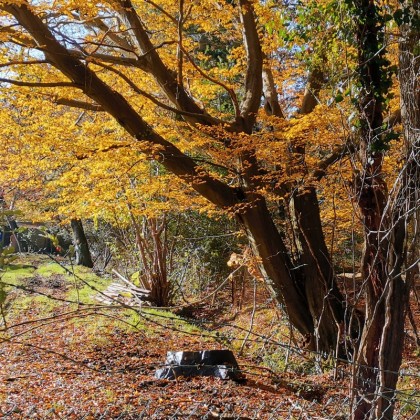
There’s a little memory from childhood of a tuft of a tree growing on the edge of a cliff
Well, just one for now. And here is the tuft which I placed. (The little red and blue areas on the top left). The resilience of which is astounding and admirable! This made me think of a childhood visit to Combe Martin Bay. On the rocks around the bay is some tufty kind of tree or bush growing in a place where you think nothing would grow or be able to stand the elements. But I was amazed last year when I saw it was still there. I remember it as a child, and it is STILL there! It was rather moving to see the amazing tuft in it’s impossible place.

combe martin bay tuft devon jenny meehan
There it is!
Acrylic Paint used with Oil Paint on the same painting – Technical Considerations
I have previously rejected the whole idea of combining an acrylic under painting with oils on top. Somehow the two materials seem to cry out against each other, oil being so forgiving and flexible, so oily and natural feeling, and acrylics being so plastic! But having spent several years experimenting with the qualities of both, I guess it was inevitable that the day would come when I would seek to reconcile these two opposing forces. Just out of curiosity as much as anything else! I don’t plan to do this long term but believe it good to try out new things from time to time.
Experiments so far have been very pleasing. I would not use an acrylic under painting for an oil on any large canvas, but all mine are 50 x 70cm and under right now. There are several advantages in using an under painting of acrylic paint and then using oil paint on top. It’s not always possible for me to paint in long, uninterrupted sessions, due to the nature of my studio space, (kitchen studio!) so getting some initial painting done with acrylics is much easier as it can be done in a more piecemeal fashion with less mess. But the quick drying of acrylics, while sometimes a blessing, is a pain when it comes to having time to mull over the painting and a pain also when mixing colours…I like to leave colours I have mixed around both on the mixing board and the painting itself, in order to think about them, and adjust in slow and gradual stages, but unless I want to spend the day with a water sprayer in hand, this just cannot happen with acrylics. I also like to use the same colour over several days, and this is much easier to do with oils. You can get slow drying acrylics and retarders, and also “stay wet” palettes, but I think it’s best to go with the nature of the paints you are using, and not try and make them something they naturally are not.
Using oils for some of the uppermost layer also brings some gloss to parts of the painting surface which with abstract paintings can be utilised in an interesting way. I don’t use the oils for a complete covering of the acrylic, just for some parts of the painting. I might decide to even over the finished painting with a thin picture or retouching varnish suitable for both oils and acrylics, or maybe just leave some of the matt or semi-matt acrylic as it is and let the oil, with it’s rather more glossy surface, sing along in variation. Using medium (turps and linseed) with the oil makes it heavenly to apply and ensures it is well bound. Using the oil paint undiluted brings some nice buttery texture into the work and is so much lovelier to use and probably works out cheaper too than heavy body acrylics. I only use small areas of thicker undiluted oil paint on top of the acrylic.
I don’t use the oil diluted with white spirit on top of the acrylic as I feel there would be too much risk of the paint not being sufficiently bound, and therefore loose. It would be different if painting just with oils…A slightly loose under painting would soon be resolved by the layers above it and by a final application of varnish if need be. Also, my abstract paintings when painted with an acrylic bottom layer, often have a great variety of surfaces, thickness, and finish, (even sometimes glossy areas) and the use of medium in the oil paint makes a great deal of difference to the success of combining the acrylic layer with the oil paint on top. I’ve just done a few for the time being, as experiments, but so far they are looking good. I don’t think I would feel happy about using lots of oil paint over the acrylic paints on a flexible canvas of a large size. I think it far better to stick to using a rigid support if working larger than 50 x 70 cm because of the difference between the two types of paint. I have found so far that smaller canvas’ are easy to keep firmly stretched and I am thinking that if any problems did arise (which I don’t think will be the case, but I still consider the possibility) it would be easy to remove the canvas from the stretcher bars and simply bond onto a rigid board backing.
Technical considerations when using acrylic paint and oil paint in one painting are important and should always be born in mind. My philosophy is do what you want but know what you are doing and what the possible consequences might be. While I am not imagining conservators working on any of my paintings in the times to come, I do certainly want to be sure that people buying my paintings will have something which is technically sound. If my paintings change a bit over time, that’s fine. There is a kind of beauty in that anyway. If bits start falling off and the whole thing endures some kind of painting personality change, then this is not good, and disappointing for everyone! I am very strict about my pigments… The colours really do need to stand the test of time. I also spend a great deal of time (probably far too much) testing out different combinations of layers of materials, different mixtures and different proportions of binders, fillers, textural materials and pigments…I just love it! I find some useful things out through it too! One of the most useful things is that you need to test out the qualities of your materials for yourself, because proportions of ingredients are not usually stated and different brands make quite different products with the same or similar names!
The most important point about using acrylics and oils in one painting is of course that you won’t be mixing the two together! And the other major point is that the acrylic paint must go on the bottom, and not be placed over the top of the oil paint. Oil paint oxidises as it dries and when fully dry is very hard and rigid. Acrylic paints are softer by nature, but the extent of this would vary depending on the quality of the acrylic paint. Acrylic paint with a lot of filler is logically not going to be as hard as one which has a greater percentage of acrylic binder. Generally the higher quality the acrylic paint the glossier it looks, because acrylic binder is glossy by nature. High quality acrylic will still be sufficiently hard to make a good base for the oil paint. It is worth noting that emulsion paints with a high proportion of acrylic resin are used in exterior decorating applications, and this is because the acrylic resin is tough and makes the paint harder and more durable. It’s also worth noting that paints labelled “Acrylic paint” should be just that, but I have found, (through testing,) that with some products, the dried so called “acrylic” medium or paint sometimes actually makes rather a soft and flexible layer, which suggests that the proportion of acrylic in the paint is questionable.
All the commercially made so called modern “gessos” nowadays are acrylic based…Think along the lines of acrylic resin based medium plus chalk or a similar filler and that’s a good enough idea of what you are getting. The more chalk (calcium carbonate) in the “gesso” the more absorbent your ground is. (The softer too, though also more matt) It is now a standard practice for painters to use canvas coated in layers of acrylic modern type gesso and then paint on the top of it with oil paints. So another layer of thin high quality acrylic paint on the bottom layer is not going to make a great deal of difference. It won’t be so absorbent, but this may be what you want. Even neat acrylic is micro-porous and I have not experienced any problems with adhesion of oil paints on top so far.
What IS important is that the acrylic is totally dry I mean dry and cured! I play it safe and wait two weeks even for a thin acrylic under painting. For a painting with slightly thicker areas and textures, I wait at least four months. If I don’t want to wait, then I just stick to using either acrylics OR oils…It is easier to paint layers over existing layers of the SAME kind of paint as you know you will retain the integrity of layers more easily. Sometimes I will use an isolating layer of acrylic based varnish over the acrylic painting and then use the oil on top. Varnishes tend to be of a more reliable quality with respect to the amount of acrylic in them than many paints do, because they are specifically made to be hard and protective. Logically they would make a better match with the oil paint in terms of rigidity, and I have not found any problems with the oil adhesion to the acrylic based varnishing products I have used, as yet. This is useful if I have been using loose acrylics (which I do deliberately sometimes!) and/or I want the surface well sealed, maybe because I don’t intend to varnish the painting at all when it is completed with the final areas in oil. I have done this with paintings using acrylics and oils on both rigid substrates and canvas, with no complications, though all of them have been under 50 x 70 cm. They had some textured areas and because I had used a variety of different textures and quantities of filler, I felt it best to provide a surface which was a little more uniform to receive the oil paint. So one or two layers of a quality matt or satin acrylic varnish makes a great isolating layer between the acrylic paint and the oil paint. I have not found this to be a problem at all.
You read a lot on the internet that a rigid surface is always preferable for doing a painting with an acrylic bottom layer and an oil top one, because of the need to reduce any flexibility in the acrylic layer, but I have found no issues arising with my own acrylic paintings on canvas, though I do keep the top oil layer fairly thin, use plenty of medium and don’t use great slathers of thick oil paint on large areas of the painting. I tend to use the oil paint for parts of the painting, rather than one continuous layer, and I find this makes for a very exciting surface on abstract paintings. It is certainly worth a try and I think opens up some interesting experiences as a painter, and I am glad personally that I have stepped out in this direction with my abstract paintings, as it utilises the fine qualities of both the types of paint very well indeed.
Jenny Meehan works mainly with either oils or acrylics creating both abstract/non-objective paintings and also semi-abstract work. She also produces representational/figurative artwork, mostly using digital photography/image manipulation software, painting and drawing. Both original fine paintings and other artwork forms and affordable photo-mechanically produced prints are available to purchase.
Enquiries welcome. I have more artwork than I can display on the internet, so let me know if you are looking for something specific in terms of style, function, or subject matter.
Also, you could follow the Jenny Meehan Contemporary Artist’s Journal at WordPress and keep informed that way.
Note About Following Jenny Meehan Contemporary Artist’s Journal
I would be very pleased if you would choose to “follow” the Jenny Meehan Contemporary Artist’s Journal at WordPress and keep informed of what I am up to this way. Just press the “follow” button and pop in your email address. You determine how often you get updates and you don’t need a WordPress account to follow Jenny Meehan Contemporary Artist’s Journal. I don’t have a Facebook page as yet, and won’t be on Twitter. So this is the best way to follow my art practice. Though I ramble on, I try to organise things for easy skimming, so you can pick and choose according to your own interests quite easily!
Notice regarding my use of images on my Jenny Meehan Artist’s Journal blog: I always try and contact the relevant artist if I include images of their work on my blog and make clear the source. Where images are taken from other websites, I make it my practice to cite the source and normally include a link to the place where the image was found. When I include images I do so in the belief that this will not cause commercial harm to the copyright holder. I believe that this is fair use and does not infringe copyright. Images are used in order for me to comment and reference them in relation to my own creative and artistic practice. When I include extracts of text, I also do so with the understanding that again, this is permissible under the widely accepted fair usage terms with respect to copyright.
How to Support Jenny Meehan
If you like my art working and would like to support me you can!
Just put
in your browser and follow instructions. There’s no option for me to thank you via the PayPal Me process but do contact me via contact form and let me know if you have gifted me so I can thank you.
You can buy my original paintings directly from me personally.
Just contact me via the contact form. Price range is between £250 and £400.
Sometimes they are offered for sale during exhibitions too. Normally its more expensive to buy them this way, (though not always). Some organisations enable me to price my work in an accessible way due to the way they operate, but if a submission fee is required I obviously have to factor it in.
I dislike this system, but art exhibitions are used to generate funds for different organisations and charging artists to submit artwork (to submit… Even if not accepted!) is one way this is done. There are also other costs incurred by the artist in supplying the artwork for exhibition. So artists artworks sold during an exhibition are frequently more expensive for an art collector to purchase. It is often preferable to approach an artist directly and view work by arrangement in person.
If you are thinking of buying one of my original paintings I can arrange a viewing for you. If you are looking for something specific in terms of colour and/or style, just let me know because I have many more paintings than I am able to display online. I can send you further information on the process of buying artwork directly from me if you would find that helpful. I appreciate that it is unfamiliar ground for many people.
Also available via redbubble, the well known print on demand marketplace, you can buy unsigned prints on many substrates. This is an easy and convenient way to purchase my art online.
Take a look here:
It’s also a very good place to get a feel for quite a big strand of my creative artworking. Any problems locating what you want, feel free to contact me via the contact page on this Art Journal/ Artist Blog.
I have TWO Redbubble Artist portfolios! The “jennyjimjams” one has most artwork on it at the time of writing.
My two Redbubble Artist portfolios are;
I have mostly the abstract, flat colour geometrical art in Redbubble as it makes nice prints. I selected work for that platform in order to help my work become more accessible. There’s also a lot of surface pattern designs. I post more of those on my
Artist profile. I find creating patterns very therapeutic!
The main style of my original painting is Lyrical Abstraction/Abstract Expressionism. I also enjoy working with black and white photography tending towards pictorialism. I frequently use collage and digital collage.
Copyright and Licensing Digital Images Information – Jenny Meehan
Copyright in all images by Jenny Meehan is held by the artist.
Permission must be sought in advance for the reproduction, copying or any other use of any images by Jenny Meehan. Individuals or businesses seeking licenses or permission to use, copy or reproduce any image by Jenny Meehan should, in the first instance, contact Jenny Meehan.
Copyright for all visual art by Jenny Meehan is managed by the Design and Artists Copyright Society (DACS) in the UK. If you wish to licence a work of art by Jenny Meehan, please contact Jenny Meehan in the first instance to clarify your requirements.
DACS always make an initial proposal for image licensing fees in line with the industry standard. Personally, I am open to negotiation. So contact me in the first instance so we can discuss your requirements, project, and budget. The Designer and Artists Copyright Society will administrate accordingly.
It is I, the artist, who determines the final licensing fee, and there are often projects, charitable organisations, people and smaller ventures with which I am particularly keen to work with because of a shared vision. I appreciate budgets can be restrictive. While image licensing fees for my art images will broadly based on the industry standard, this is a guide amount, and can vary subject to circumstances.
The administration for organising an image licence is straightforward for both parties, and is done through the Design and Artist Copyright Society. They provide you with the licence paperwork and I supply you with the image.
