Temporary Studio Space!
Art Journal Post November 2019 by Jenny Meehan

Studio Space
I am delighted to now be sitting in a studio space! It is miles easier than working at home, and though I can only afford to rent it for one month, I know I will make the most of it. Having a dedicated space for art working is very helpful and does induce some new opportunities. Even being able to leave things out is productive.
The studio tent is too cold right now in November. Though it’s excellent in the Summer to work outside, it’s not possible at this time of year. The kitchen table at home is often another place I work on, but that too has it’s limitations.
If you would like to assist me in funding a studio space, then please do make an offering through my paypal me page. Studio spaces cost around 200 to 350 per month and that’s out of my league at the moment, and probably always will be.
So what will I be doing in this studio space…? I am bouncing several ideas around. I have several ideas, but the main point is to have the freedom to experiment. However, a big plus which I will be enjoying, is that I have a big wall and so I will be able to work on a bigger scale than I have previously done, and have the experience of painting on a large scale while standing up, as normally I have my paintings on the ground.

Here is a place to hit my head against a brick wall. Very useful!
Interestingly it was a wall which I discovered in my wanderings through the rear access roads of Chessington many years ago which served as an incentive to start to paint and explore paint and substrates in more depth.

©Jenny Meehan
jennymeehan.wordpress.com
Someone had painted it as above which I loved. They didn’t need to. It must have been a creative impulse to bring a little bit more colour into the world. I love it!
Which Paints?
I have brought along with me a few acrylic paints and some Sol- Silicate paint. I prefer my Keim paint to any other, and the pigments used I much prefer, but I have brought along some acrylic paints as well.
I tend to favour the use of inorganic pigments in my painting. Its a route I started to travel on after completing a mural using silicate mineral paint and I continue to work with silica sol paints in particular. These incorporate earth and mineral pigments which are produced in simple chemical processes. They are also permanent with great lightfastness. So no worries about fading over time.
Today organic synthesis chemistry offers a virtually endless number of artificial colouring substances. They are all secondary products of crude oil with the corresponding high loads on the environment when being produced and disposed of. I prefer the traditional mineral and earth pigments. I find when I do use others, I have to tone them down and knock them back by huge amounts. The one area where I do enjoy the cruder, wilder, synthetic colours is when used in dye sublimation printing, and if suitable, I enjoying translating some of my digital imagery onto fabric.
But I have brought along a few, though I suspect I may be muting them considerably!
Backwards is the new Forwards
Part of my practice as a visual artist to reflect, recall and remember.
When it get’s to this time of year I do tend to look backwards.
One of the highlights for me was having my re-design of the International Access Symbol accepted and shown as part of the Shape Arts Open Exhibition this year.
Mainly because it was exactly the right place for something like this to be shown. And because this piece of art /design is the fruit of my own personal experience with using disabled facilities because of personal need.

ISA international access jenny meehan © Jenny Meehan. All Rights Reserved 2019,
Inclusive Re-design of the International Symbol of Access (ISA) by Jenny Meehan © 2019 All Rights Reserved
Above you can see some of the fruit of my labour! The labours of my life!
My re-design of the International Symbol of Access retains the buoyant feeling so important in “No Problem/Moving On” ) I designed this symbol in February 2019 with clear concepts in mind. My own experience of temporary disability before and after knee replacement surgery certainly inspired me to work on an alternative symbol to the International Symbol of Access. I got sick of the sight of the wheelchair symbol!
But I want to know from many people who face disability of different kinds what it expresses for you personally. Having knee replacement surgery and the reasons for that have changed my and awareness, but I have also been reminded that for a lot of people they have mobility restricted long term. Is a redesign of the International Symbol of Access (ISA) needed? What do you think?
My design came from personal experience. I felt uncomfortable using disabled toilets marked with the wheelchair symbol but I needed to use them. It made me think about the essential elements I felt should be conveyed in the symbol. You see the circle, previously a wheel, transformed into an opening. You see the right angle, previously a seat, transformed into the outstretched arms. You are accommodated. It’s a person centred design with a clear message of inclusiveness which is key. Having my own less visible, temporary, experience of difficulties and restrictions of mobility I hope my expression in this design conveys something positive and affirming.
There is also an expression of a person coming through, forwards and upwards and outwards. I can identify with that… I have certainly been on a journey with my own mobility. (One which slightly continues, as still with osteoarthritis and also my un-operated knee does affect me.) But I don’t need to use disabled toilets any more for the time being at least.
When I look at the wheelchair symbol it makes me think how many people it misses out. It reminds me of how differently I was treated when I was using a stick and/or a crutch (not always favourable, by the way!) and also reminds me that though the tools and objects we can use to help us are important, they can get in the way when it comes to perceptions other people have of us as PEOPLE, first and foremost.
You can get those here:
I would really value your thoughts and experiences though so contact me with your feedback!
One of my favourite products using this particular design on Redbubble.com is the clock. The reason for this being that, with time, things do change. Also time can change anyone’s situation. I didn’t expect to experience mobility difficulties and restrictions, but in time I did. Also things may change for me in the future. We all take what we have for granted. It’s a good practice to think beyond what we know. And things do change.
I think the wheelchair symbol should change, but no doubt any change is fraught with restrictions, and so many countries would be involved and so many approvals made, that it may never happen. However, this doesn’t mean it’s not important to think, talk about, and envision. It’s an imaginative tool for conversation ,thoughts and sharing experiences at the very least I hope.
My design is also published in the catalogue from Shape Arts Open Exhibition 2019 which you can buy from Shape Arts.
There was a fantastic selection of art on show.
Here is general info on ShapeArts:
https://www.shapearts.org.uk/pages/news/category/shape-open
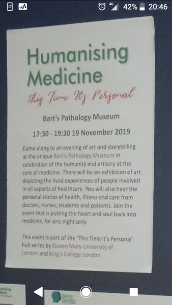
Black and White – Humanizing Medicine at Barts Pathology Museum
I’m really into black and white at the moment!
I have a long standing interest in Healthcare which started years ago when I worked as a Dental Nurse and it has never gone away! I was very pleased to find out about the “Humanizing Medicine” call out for artists.
Being Human: A Festival of the Humanities was held at Bart’s Pathology Museum on Tuesday 19th November 2019 5.30 – 7.30pm It was a truly fascinating place! I loved it. Photography of specimens is not allowed, but seeing them and hearing about them was an amazing experience.
barts pathology museum art exhibition jenny meehan humanizing medicine art and poetry exhibition as part of the Being Human festival

barts pathology museum art exhibition jenny meehan humanizing medicine art and poetry exhibition as part of the Being Human festival

barts pathology museum art exhibition jenny meehan

arthritis, humanising healthcare art, jenny meehan, barts pathology museum exhibition, butterfly art,

arthritis, humanising healthcare art, jenny meehan, barts pathology museum exhibition, butterfly art,
It was a celebration of the human side of medicine…Holding an art exhibition is such a great way to do this!
There are many amazing specimens to see. Here is a taster:
https://www.qmul.ac.uk/pathologymuseum/specimens/
Butterfly Net Image and Poem – For the Humanising Medicine Exhibition
arthritis, humanising healthcare art, jenny meehan, barts pathology museum exhibition, butterfly art,
“Barts Pathology Museum is based in St Bartholomews Hospital at West Smithfield and houses over 5,000 medical specimens on display over 3 mezzanine levels of the Victorian museum.
Prior to the appointment of the current Technical Curator, Barts Pathology Museum was in a state of disarray. As medical teaching changed, the need for the study of anatomy and pathology pots declined.
Without funding the specimens and the infrastructure of the building suffered and it wasn’t until a couple of years ago that a donation was secured to renovate the collection. Grant funding was provided by The Medical College of Saint Bartholomew’s Hospital Trust, a registered charity that promotes and advances medical and dental education and research at Barts and The London School of Medicine and Dentistry.
Events were originally scheduled for after the completion of this project but the museum has opened slightly earlier than expected due to its physical arrangement. The conservation and cataloguing still continue.”
and
“Barts Pathology Museum, a part of Queen Mary University of London , is a medical-humanities hub and venue for public engagement and education. Our events showcase research and the arts from our own institution as well as other universities, independent researchers and other museums. Our activities are in accordance with Human Tissue Authority recommendations on Public Display of medical collections and the University Museums Group guidance, and are sensitive to the dignity of the collection.
Ant Parade by Jenny Meehan

ant parade by jenny meehan ©jenny meehan
I have this work back now after it was exhibited as part of the North Pennines AONB Partnership’s Cold-blooded and Spineless project Subterraneous exhibition. Subterraneous is part of an AONB Partnership project and Cold-blooded and Spineless was funded by the National Lottery Heritage Fund. It was great to be part of that and it looked excellent.
I have used the base design which was exhibited and developed it a little so that it is available via Redbubble.com.
Above is the link to the Greetings Card, but its available on 32 products and in different colour ways. Buying merchandise with my designs on gives me a small royalty percentage which I use towards the continuation of my creative project, so do please purchase something if you like it. It’s a great way to get something unique and support an artist at the same time.
Items are not sold in large amounts… There are so many talented artists on Redbubble.com, which is great. So if you want to collect some examples of my work in an easy and affordable way, then buying examples from Redbubble might be a way of doing so. Items are not signed by me, of course, but does this matter? In the end, if you like my work and you want it, I want you to have it, in the easiest and most affordable way. Yes, I sell my original paintings for much more, but I don’t think any false idea of exclusivity has any place in what I do.
Memory Lane
Down Port Hill,
Kentisbury.
It was just “the lane”.
We rode our bikes, me and my brother,
down the lane held into the beautiful hedgerow.
The china in Preston Cottage was (I discovered later) designed by Alfred Meakin.
“Hedgerow”
I made sure I had a milk jug as an adult, of the same design
because from it’s lip
spoke fond memory
Of time.
Time
when you and me could play,
putting our hands into waters
which leapt over
all obstacles
merrily.

preston cottage port hill kentisbury exmoor north devon
Bottom left image is of Preston Cottage, which I think is still now called “Next Week” in 2012. Other images show Preston Cottage as it was in the 1970’s when our family used to go there for our holidays. The view on the top right means so much to me…We used to run through that gate to the bottom of the field where it was possible to make a bit of a dam and play in the pool of water which formed. Preston cottage was extended to the side… When we stayed there it was just two bedrooms. The water supply was the spring and the water came out brown a lot of the time!
We would get our eggs from Mr and Mrs Tucker, the farmers at Preston Farm. They had lots of chickens and cats, along with cattle, and they were always very friendly and kind. Preston Farm now is listed as run by D.g Pile. So I take it it is still a working farm of some kind.
EX31 4NH Kentisbury
Do you need Licensable Images?
My artwork is particularly suitable for themes of: faith, religion, philosophy, Christian, church, all faith traditions, inter-faith, spirituality, the subconscious, psychoanalytic themes, mindfulness, contemplative practices, healing, health, both physical and mental, trauma recovery, metaphysical and psychological focused writings, the devotional life, and many other subjects.
Indeed, pretty much any subject matter or theme which benefits from a more abstract graphic image; one which also conveys basic feelings and ideas in an open and experimental manner; would benefit from it’s clarity of communication being enhanced by one of my art images.
DACS administrate my licensing agreements and organise the use of my art work images quickly and conveniently. They are very helpful and can guide you through the process if you are unfamiliar with it. I normally charge a fee based on their guidelines, but with flexibility depending on exact circumstances. Their fees are proposed by them, but as a living artist the decision is mine and I tend to charge under the industry standard for smaller projects.

Woman in a Chemise by Picasso
