John Lewis Foundations – Motherhood of God – Life Drawing – Carter Heyward – Progressive Christianity – Richard Rohr – Cezanne
August 3, 2023
Painting, Painting Painting!
Art Journal Post August 2023 by Jenny Meehan aka jennyjimjams
Well, it is July (ooops! Late again! It’s now August!) and this is the time of the year when I do a lot of painting/ collage! I don’t have anything finished to show you right now but here are some images of what I have been doing. I am fortunate to have a garden, which I love, and in that beautiful space many of my paintings start to come to a life of a sort!
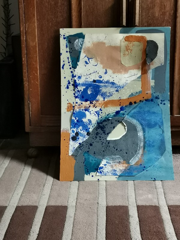
Abstract Painting in progress by Jenny Meehan aka jennyjimjams
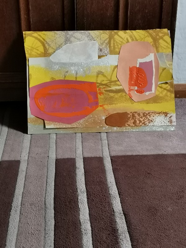
Abstract Painting in progress by Jenny Meehan aka jennyjimjams
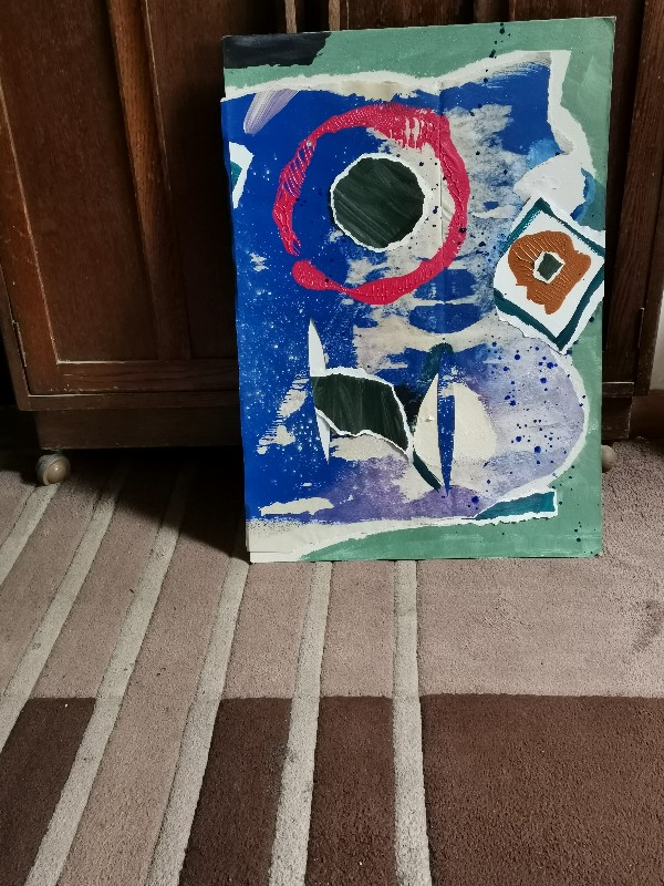
Abstract Painting in progress by Jenny Meehan aka jennyjimjams
These are all in progress, yet nearing their final stage and suggesting feelings and ideas very faithfully to me. It’s a great stage to be at…
Rather than stick edges down so they are always close to the surface I leave some with spaces… This development came from my work with mosaics and is a good example how varying media can be very productive. I find the shadow areas interesting in mosaic and having got the interest I can’t forget it!
Life Drawing Class at Hillcroft College Surbiton
Here’s a few examples of work I’ve been doing in a super life drawing. It’s been really good fun!
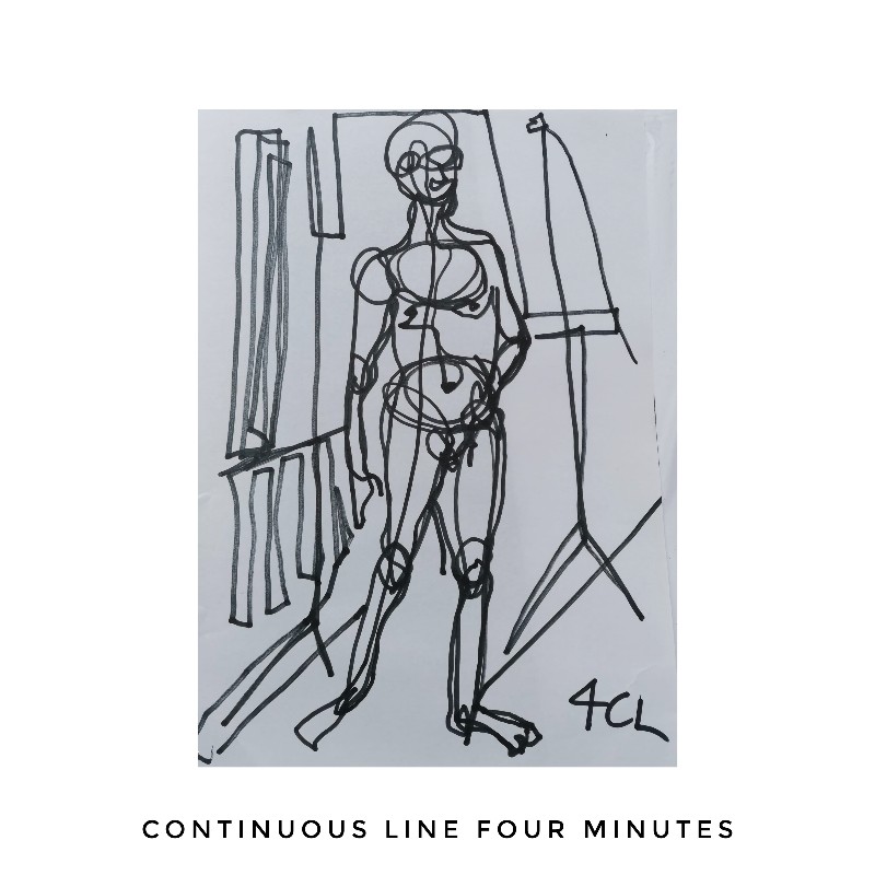
Life drawing Continous Line drawing by Jenny Meehan 4 minutes
I think this one merits a title as it asserted itself so naturally, so I reckon that “4CL Connection” is good as I have been thinking and reading a lot recently about having a stronger sense of connection, both within oneself and also with others.
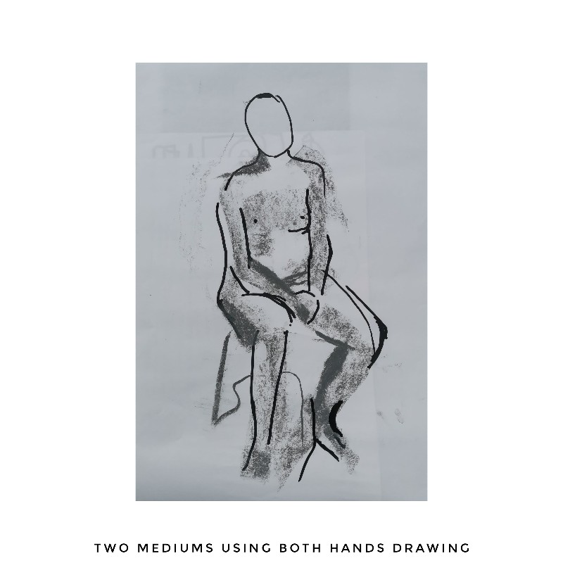
Life Drawing with Two Mediums, seven minute pose. And what to call this one with its empty head? I think that “Mind in Body” may be right for this. I’ve been thinking about this aspect of Yoga and the way we can bring our awareness to our different parts, and as the pose looks quite reflective and rested, I think this title is apt.
These two below were short poses, can’t remember the time exactly but less than five minutes
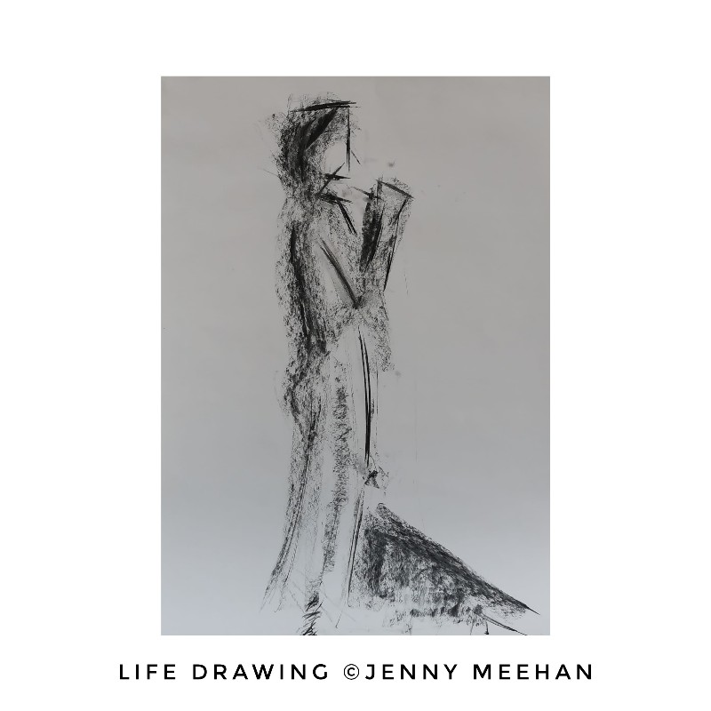
Quick life drawing by Jenny Meehan
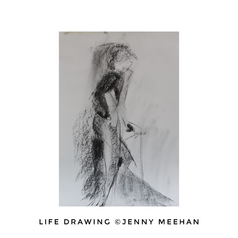
Quick life drawing by Jenny Meehan
I’m enjoying sharpening my eyes with observation, so I’ll be looking to continue life drawing in the Autumn. To have the human body as a motif in my work seems good for this time when I’m feeling so much more grounded and connected to my own. My long term focus on emotions… On locating them and expression of emotion gets even more interesting when linked and connected to the body so this seems a good direction to travel in.
John Lewis Partnership Foundations
Bit of a flip back in time now to an early work, “John Lewis Partnership Foundations 1987”. I like to look back now and again and this work was the first piece of art I sold! It was sold to John Lewis & Partners in 2007. I printed the digital image onto canvas which suited it well. It was a very encouraging moment to sell it and even more so in that it went to where I wanted it to go! Here’s my blurb on it, from that time:
A large inkjet print on block canvas was purchased by the company at the Kingston Contemporary Open Exhibition 2007.

John Lewis Partnership Foundations 1987 by Jenny Meehan Digital Art Print
“John Lewis Partnership Foundations 1987 by Jenny Meehan
Conceived, created, and printed May 2007
Digital print on canvas
This artwork was created from a photograph taken by me in 1987 as I walked over Kingston Bridge, and shows the foundations of the John Lewis building in Kingston- Upon-Thames. It celebrates the positive and inspiring vision of partnership which John Spedan Lewis brought into reality within his own work, in his own lifetime, and now beyond that. As I looked at the company website and read through some of his words and learnt about what he had done, I found a real pioneering spirit at work, and it inspired me to create this piece. The involvement of John Lewis with the arts in the borough is also very much something to celebrate, and for this reason I specifically created this piece for the Kingston Contemporary Open Exhibition in 2007. It was selected for the exhibition, and purchased by John Lewis Partnership for display in the Kingston Branch.
In the image you see two people at work – a distance apart, but still with common aim. In many organisations today, the individuals desire to work together, whatever their relative status, is what will eventually result in constructive changes and these of course do not only come from the top but happen at many levels; people with faith and vision will carry on working even if the end result is not in sight!
The image is quite deliberately printed onto canvas – photographs on canvas might be considered “not real art” but the reality is that for an increasingly large number of individuals and companies today this is the way they will experience the visual arts in their own setting and this is no bad thing – value and status are not the same thing!
If an image makes life just a tiny bit brighter, more interesting, and stimulates thought and emotion, creates space for memory or vision, then it is well worth the effort and is art in all its glory!
With all the new building going on in Kingston, I really liked the idea of bringing forward an image from the past and representing it in a modern way; digital photography has completely transformed photography as an art form…it has now so much more in common with painting. But, this change has not destroyed its history, which is why I have manipulated it in a way to accentuate bright “paint” like areas and yet at the same time accentuated the grain present in the original negative. The presence of the past form is still very much felt, and while it is easy to tend to resist new developments, it is possible, with careful consideration, to have a good balance which works as a whole”.
Wow, that was years ago… It was a super boost to my confidence at the time for sure!
Carter Heyward
Sometimes you find an author to read who is just a perfect fit for where you are at a particular time, and for me that author is Carter Heyward… Here’s another super quote from the introduction of her book Touching Our Strength:
“The search for liberation, profoundly personal and political, is an intrinsically relational adventure. We search together. It is our active solidarity with one another that generates our discovery of who we are together and hence of who each of us is by particular name and unique yearnings and special talents.
We are not photographs. The reality of our lives is three-dimensional: Whether we experience ourselves this way or not, we are inherently relational. This is the metaphysics of all that is created. From a philosophical perspective, this is our ontological (essential) state – our way of being, the way of being human, created, and creative. We are born in relation, we live in relation, we die in relation. There is, literally, no such human place as simply “inside myself.” Nor is any person, creed, ideology, “outside myself.”
I’m thinking about this quote in particular relation to a poem I wrote a while back… It seems to meet my poem in a fruitful place, for in my poem “God has helped” there is a process of change and liberation which still holds a strong sense of the need for a deeper awareness of relational reality… A sense that isolation of self needs expansion, through faith and an opening out which embraces a greater sense and experience of mutuality.
Here’s the link to my video poem “God Has Helped.” https://youtu.be/WIZ1MHpLSSQ
I continue to read Carter Heyward’s writings enthusiastically! Here’s some more to taste!
“I suspect nothing is more heartbreaking to God herself than the denial of our power to recognize, call forth, and celebrate right relation among ourselves.’ Locked within ourselves, holding secrets and denial, we embody not merely the fear of our relational pos- sibilities; we also embody the rejection of the sacred ground of our being, which is none other than our power to connect.”
Carter Heyward in Chapter 1 of Touching Our Strength – The Erotic as Power and the Love of God”
Her writing really melds very well with previous thinking and reading I’ve made of Martin Buber, so I’m over the moon with this book, to be sure, it’s reallly such a breath of fresh air!
Progressive Christianity
I tend to call myself a Progressive and Liberal Christian as I think it describes me better than any other label, though labels are never quite right, as even within them there are so many variations! I enjoy the life focus that being a Christian gives me, and see this is most essentially a matter of following the way of Christ, which is basically the way of Love. My faith and beliefs have grown and changed over the years… I am in a very different place to that I was in when I first committed myself to Christ aged 18! I don’t hold onto ideas and dogma in the way that I used to, and being “right” really doesn’t come into my faith anymore. I am more concerned with the mystery and mysteries of God, and embracing the love and spirit of God with the understanding that I only see a speck of an image far beyond my rational mind! So I am certainly more of a contemplative and mystic than I used to be! It is the amazing work of the Holy Spirit to reveal what is good and true in life, and to set anyone, (and I mean, anyone, regardless of the faith they profess or don’t profess), into the liberty of being able to be fully who they are created to be.
I am probably still quite traditional in many ways too, and though I set out to have a questioning faith and open attitude, I am always challenged by how stuck in my old ways I can be! I find the process of reading and researching very helpful in all areas of my life though, and one of my favourite writers is Richard Rohr.
Reading the various writings and thinking over the content of the above website has been so very helpful to me. I think I have needed to do a fair amount of what is often called “deconstructing” my religious beliefs. Thankfully I seem to have managed to evolve in a manner which means I still retain my essential element of being centred in on following Christ, which is a great help to me in my life and helps provide a framework for much of my thinking. At the same time I also firmly believe in openness and in expanding my thinking and also embracing ideas which I haven’t come across before. It is often more helpful in life to retain an attitude of openness towards what we don’t know rather than what we do, and also to remember that the Spirit of God really does work in mysterious ways. I have gained a huge amount in being open to the wisdom and ways of other faiths and religious traditions and what I learn from them feeds into my own path in a very enriching way.
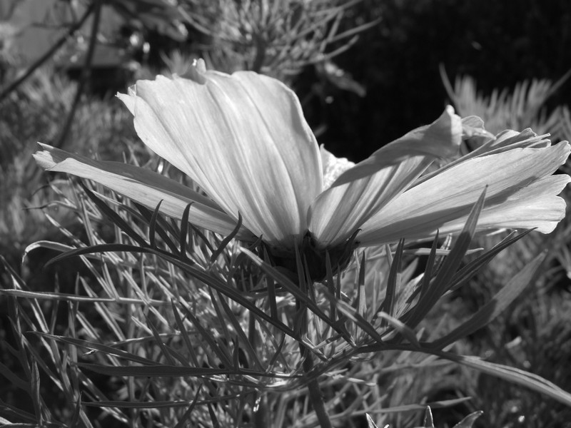
Flower Images from West Dean Gardens
Here’s a little string of flowers…In black and white. Usually we enjoy flowers in colour but taking the colour away I can appreciate the tonal variations and structure without the immediate attraction of colour. Light itself is a subject matter in its own right…the objects it bounces off do a great job of making it interesting!

jenny meehan photography
jenny meehan photography

jenny meehan photography

jenny meehan photography
The Motherhood of God
I need a sense of the Motherhood of God at this time of my life far more than I have previously felt before. I think I have always needed it, but just accepted the metaphor of God as mainly male without recognising that by letting the male metaphor dominate my thinking, I was surpressing something I really need as a woman. Something of affirmation for who I am and how I am which is transformational.
Its not totally new to me. Way back in 2007 I had an opening of mind and thought on many aspects of how I conceived God to be. This process is part of the Christian way I believe, if it’s healthy. A readiness to have changes of heart and mind. Readiness to let go of structures of many kinds which don’t serve the purposes of the liberating Holy Spirit of God.
At that time, I realised God could very reasonably be conceived of as being gay. What I mean by this is that God’s love wasn’t just expressed in deep heterosexual emotional, spiritual and physical connections, but in all types of relations to others in Love. It felt radical and even a bit shocking to me at that time, though now not surprising at all. There’s a whole story behind it, which was a complete blessing to me, but I want to stay on track with exploring my Motherhood/Sisterhood/Feminine Divine focus.
First though…
Why is God so Male? (and is he he?)
Even the Trinity is traditionally framed as male. However, I do recall some commentary I read in the past on the Holy Spirit being “she” and therefore ascribing a feminine metaphorical nature on that person of the Trinity. Still, even so, the “Father” aspect seems the dominant metaphor. Intentional or not, the Father person of the Trinity seems to come across as being the one with the most authority and therefore importance, even if it’s not technically meant to be that way.
PS.. Basically… The “trinity” model of God is just that.. Its a model and the virtue of it to my mind is that it’s all about relationship. That God is relational and so undefined in a singular sense, but that the dynamic of Love is the life breath of “one” who is, yet is also not limited, to being one.. This is what I find helpful about the concept of Trinity and why I still use it in my own thinking. (There are loads of ideas about how we can think about God using this model. Ultimately God is beyond concepts.)
Back to the idea of a male God…
The maleness which dominates our conceptions of God may be a positive for many people, but for me, (and others) the majority of male impact on my life has been so destructive for so many years that a feminine metaphorical model of Trinity is more healing. It is also more effective in bringing a felt sense of the Love of God into my life. God is experienced more fully and deeply as feminine. There is more intimacy and connection. This is healing in the fullest sense. It doesn’t mean one has to reject the male conceptions… It does redress an imbalance though… Our world really needs a greater awareness of the feminine divine, I believe.
Few other thoughts…
I’m not a Catholic, so forgive me the simplicity on what follows; I’m sure there’s a lot more to it than I’m aware of…!
In the Catholic tradition, Mary in her many expressions, including the “mother of God” particularly, brings the feminine to new prominence, but with some less helpful aspects too… female authority needs realisation in practical forms, expressed in earthly and bodily ways, ie, female priests etc. It is sad, but true, that formal religious structures of many types are indeed, repressive.
“If we are to live with our feet on the ground, in touch with reality, we must help one another accept the fact that we who are Christian are heirs to a body-despising, woman-fearing, sexually repressive religious tradition. If we are continue as members of the Church we must challenge and transform it at the root. ” Carter Heyward
Within the Protestant tradition, which I am more familiar with, (evangelical and charismatic churches in the 80’s) some folk I came across viewed the Catholic conceptions of Mary as even being somewhat evil, and though in some respects and situations women were given more freedom to minister in certain ways, the bottom line was that males were superior in authority. I think nowadays that maybe the horror directed towards Mary was a rejection of the femine divine big time, and actually rooted in sexist misogynistic ideas! This is the general impression I am left with now, at least. There was also a big dislike of accepting the mysterious and unknowable nature of God. Things had to be very black and white.
I was brought up in the Baptist Church and the one I first worshipped in as a child was led by a woman, the Reverend Sister Edna Black. I’m still tremendously grateful to her as she was a truly wonderful example who I realise still inspires me in my identity both as a woman and a Christian. She was a strong and independent woman of faith who knew Christ and expressed the divine feminine in many ways. I have a lot to thank her for… She was a true source of strength for me in my childhood.
St. Thérèse of Lisieux wrote of God’s tender, motherly love. searched for the Lord, “wanting to know, O my God, what You would do to the very little one who answered Your call, I continued my search and this is what I discovered: ‘As one whom a mother caresses, so will I comfort you; you shall be carried at the breasts, and upon the knees they shall caress you.’ Ah! never did words more tender and more melodious come to give joy to my soul.”
For those of you reading this blog mainly due to your interest in my visual artworking, my philosophical and theological reflections are an intrinsic part of my artworking. I find the relationships between my thoughts, feelings and spirituality very much inform any creative output and keeping track of developments and changes in my perspectives is a very useful tool for discerning future directions in artworking. These meandering streams flow into the same river which shapes so many aspects of what it is about life I love so much.
I am very grateful for my mind. I am very grateful for the mysterious and all surpassing work of the Holy Spirit in my life. I am very grateful for a deeper sense of connection with God I’ve developed over the many years of seeking to have an open heart to being changed and transformed in many respects.
Beautiful Sunshine
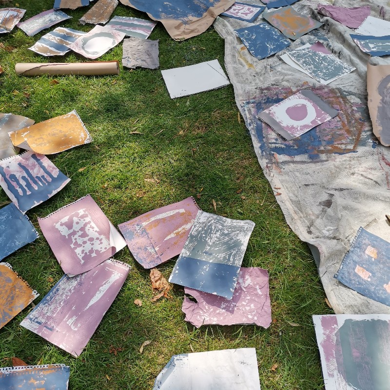
I’m very focused on making the most of any good paint drying weather we get. The image above shows some of the collage elements I’ve been playing with today. It’s a small but valuable part of my painting process as if this part is done in a mindful and prayerful way, I get many interesting ideas about themes I may like to explore in future paintings. With nothing to think about but the paint and how it and I am responding, you wouldn’t believe the variety of possibilities which open up materially either… It is the most orgasmic thing ever!
I had a little play with words too, as I needed to retreat into the shade of the house after a few hours…
In this studio without walls
I play in relations
It’s instinct
Singing with the birds
Breathing
in the air
I like it
Now I’m too hot
So into the house
May be a better place
To be me for a while
I won’t bother with punctuation
In this poem
The birds do that better
They don’t confine space
They don’t need the security
Of closing anything in
Maybe I don’t need it either?
Jenny Meehan 22nd June 2023
Last but not least… A random selection of my visual art:
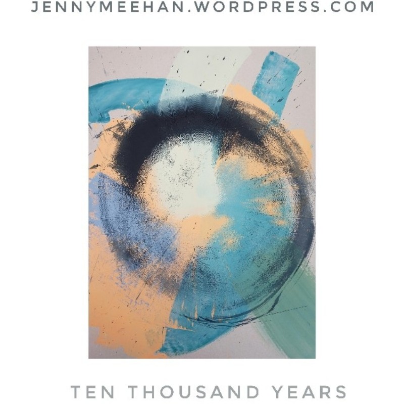
Ten Thousand Years by Jenny Meehan
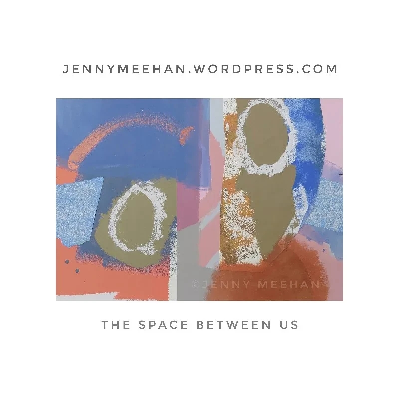
The Space Between Us painting by Jenny Meehan
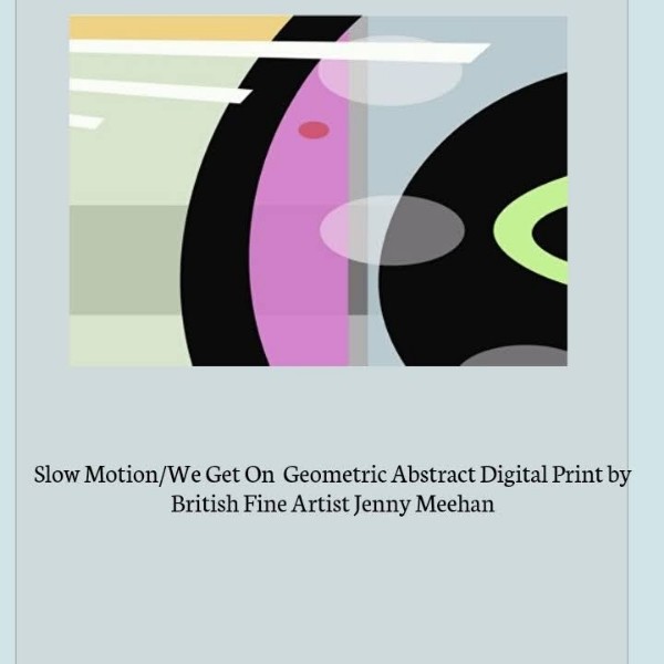
abstract digital print by jenny meehan
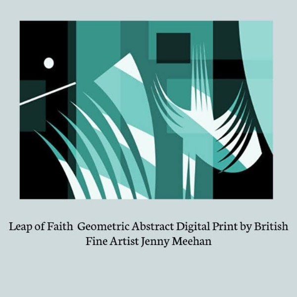
leap of faith abstract art print by jenny meehan
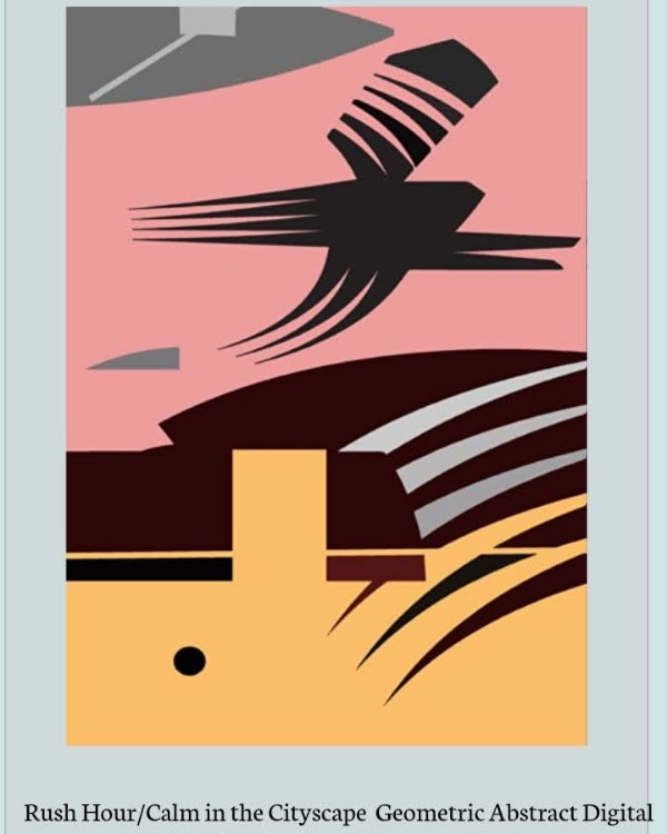
rush hour digital print by jenny meehan
Ok
That’s Enough digital art print by jenny meehan
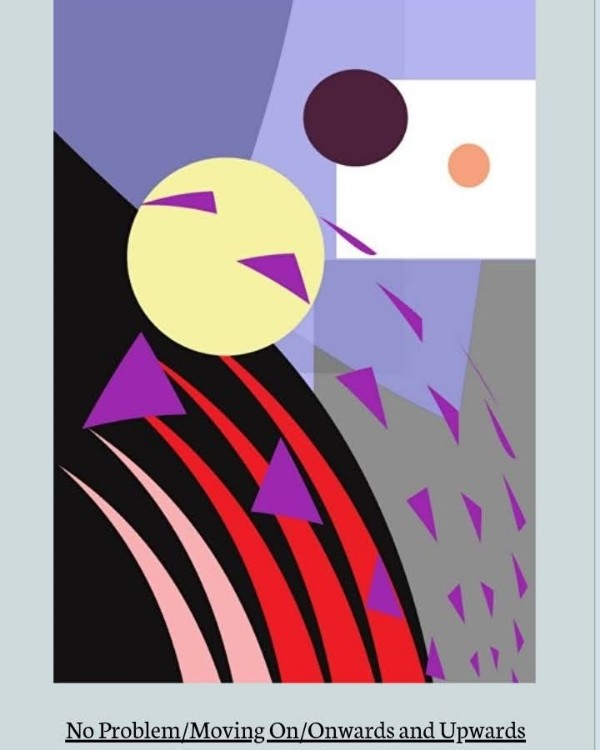
No problem/moving on art print by jenny meehan
Cezanne Painting
This is dated c 1867 – 70 and it’s pencil, watercolour and gouache on paper. The title “Woman Diving Into Water” was given to it by Félix Fénéon. I’ve picked it to share today as its a lesser known painting by Cezanne, and I particularly like his approach and use of the selected mediums. It’s not large, at just under 13cm square. It’s a reminder to me that things really don’t need to be big on size to he important and significant. As I’m swimming a lot in the sea, lakes and rivers the subject matter is particularly appealing too!
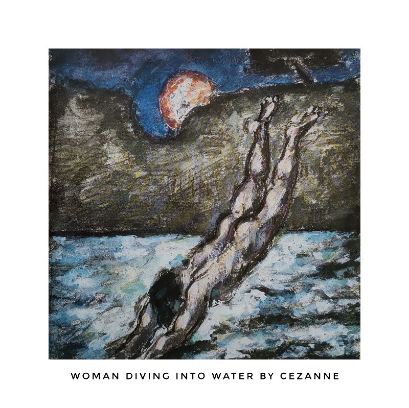
Woman Diving into Water by Paul Cezanne
It’s “Byee” from me til next time.
Here’s a continous line drawing of mine to finish this Journal entry off.
A Carousel of Posts From Jennymeehan.wordpress.com below!
Frank Bowling – Violence Video Poem – “March/Sabbath” – Luke Hannam – The Royal Academy Summer Exhibition
May 11, 2021
March Abstract Painting; Sabbath – Artist Jenny Meehan
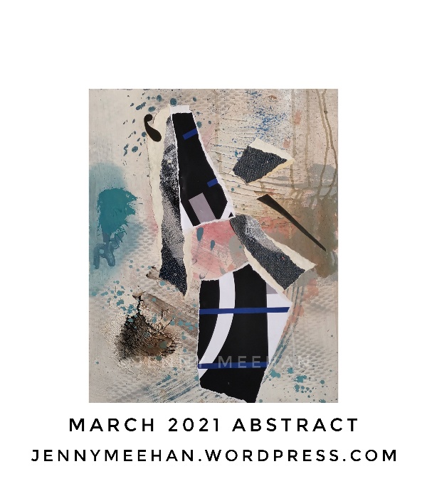
March abstract lyrical painting expressionist romantic art artist jenny meehan ©Jenny meehan jennyjimjams
Well, I’m doing very many things right now, but true to my word, I have one of my monthly abstract paintings to show you. In some ways I don’t like showing them quite so soon as I normally keep my paintings hidden for a good few months before I show them, but for this year I will be different. With the Coronavirus pandemic and no Open Studios events I won’t have the usual opportunity to show recent work so I need to display my paintings online a bit more consistently over the course of this year.
This is a painting which includes collaged elements. The roots of my love of painting can be found in several places yet a significant one is time spent gazing at walls in need of repair and decoration. Well, , not just walls, but peeling layers or paper, paint, metal, plastic: coatings and coverings of various kinds subjected to wear and tear, the elements, and the general effects of time! It’s not surprising to me that I now see my fascination emerging in my paintings. I’ve beaten my way through some rigorous experiments with colour and texture, and now expressing the idea of “beauty from brokenness” partly through the use of torn and cut collaged pieces seems to sit well with me.
While I am naming these monthly paintings by each month, it doesn’t agree with me to not think a little deeper, so as is the case with a lot of my original fine paintings I have also given the March painting an additional name; Sabbath. Myself and my husband have been thinking and talking a lot about Sabbath rest, and the need to just stop and have breaks in the passages of activity which run so enthusiastically through.
April’s painting is still in progress… So will be a bit late! And you see, my April blog post has moved into May…. Oh dear!
Frank Bowling Painter
This is an extract from a really interesting read on the artist Frank Bowling.
The constant pushing of boundaries regarding experimentation with paint and materials is obviously very inspiring!
https://www.tate.org.uk/research/publications/tate-papers/31/frank-bowling-material-explorations
https://www.tate.org.uk/research/publications/tate-papers/31/frank-bowling-material-explorations
This section on Frank Bowling’s larger poured paintings is a joy to read… Also very interesting is how he changed his painting when in a smaller space in London and makes mie delight again, as always that “Necessity is the Mother of Invention”.
“London and the ‘poured paintings’
Always looking for new ways of painting, both in terms of representation and the application of materials, Bowling stopped creating map paintings around 1973. He wanted to remove all signs of direct touch and directed application of paint, to move away from expressionist gesture and ‘invent [new] ways of using the traditional ways of applying paint’.
Thus began a new phase of painting for Bowling when he produced what are now referred to as the ‘poured paintings’.
Bowling created these poured paintings using a self-made wooden contraption that allowed him to tip, tilt and twist the canvas while the paint was poured directly onto it from heights of up to two metres. In this way he could exert a certain level of control over the direction and speed at which the paint travelled down the canvas, while also allowing it to find its own paths. Bowling first experimented with this method in France in 1973 while visiting artist Elizabeth Frink. He then developed the process further when he returned to New York, where the large loft space he rented lent itself to such a physical and expansive technique.
The tilting platform was 6 ft 6 in (198 cm) in length and had pins in the legs at one end that allowed Bowling to adjust the angle of the board and thereby the speed at which the paint travelled. Bowling tacked raw cotton duck canvas onto this board, then soaked the canvas in soapy water until it was dripping wet in order to release the surface tension of the fibres so that the ‘surface becomes taut and allows the paint to move more smoothly and easily down the surface’.
and
“After this, the paint was applied at the upper edge of the canvas, and the board was lifted and the paint allowed to run and spill down to the bottom, resulting in richly layered shifts of colour. Agility was key; Bowling made these paintings completely alone and ran between the two ends of the mechanism, tilting and then catching it again before the paint reached the bottom so that the colours swirled back on themselves. As Bowling described it: ‘I gradually take the pegs out of the table legs so the paint just gradually moved from high to low. And of course, you have to watch it like a hawk because it could run too fast and then you’d have to settle it down. And then sometimes I would let it just go whoosh.'”
After this extract, the article then goes on to describe how the limited studio space Frank Bowling had when in London affected his paintings and also how the way the paint was dried very quickly, (out of necessity due to limited space) , produced paint effects which Frank Bowling liked and replicated later.
I find it comforting to read this… Its an example of how what can first appear as restrictions don’t automatically mean the outcome of them is restrictive. With my own painting what I do is certainly affected, for example, by the seasons. Activities carried out in the Studio Tent are different to those painting experiments and experiences done in the garden. The weather has a big impact. I too use different drying conditions to influence what happens with the paint. I use light and the way is varies over the course of the year to direct the kind of creative calendar I follow. It is an inspiring and wonderful thing to respond naturally in a spirit of exploration and positive anticipation of new things coming out of apparent limitations.
I remember seeing a programme on Frank Bowling… I think it was last year, and though he then relied on others more physically due to restrictions on his own mobility, it wasn’t a negative… It isn’t… It is just difference of circumstances and adaptions and changes which alter a process. It is no “less” Frank Bowling’s painting.
When we face change it involves loss. But it is not loss into nothingness. It is a movement into more. Its just we don’t know what that more is, and it can be scary because of that.
I sometimes think this is why I love painting so much? I put myself constantly in a place of risk. It may be an odd aspect of having been too well acquainted with fear, insecurity and trauma in my developmental years? Maybe a positive aspect is that fear in the realm of painting actually seems very safe in comparison? I don’t know… I could be getting over analytical here but it’s an interesting consideration I feel.
Coronavirus Pandemic Art Design Project
On a slightly different matter, I would again like to include something about my Coronavirus Pandemic creative art project. It is the case that now the weather is improving and I am able to move into my Studio Tent. So, rather like the birds in their nests, after much moving around of objects and clutter, and rearrangement of elements, a place is prepared for the birth of new wonders…
YES….it is the beginning of the painting season for me! So I will be less on the computer! But I do still add the occasional new design option for my facecovering range. I will continue to do so. Even with the vaccinations I think this Pandemic will need a lot of patience and the wearing of facecoverings is going to be a long term experience for us all.
My coronavirus pandemic creative art project is focused on disability awareness, specifically with respect to those who are hard of hearing, deaf, or Deaf. This has provided a useful option for face coverings I believe and its my way of using my creative abilities in a more explicitly useful way.
I hope they are helpful and do please give your feedback for this coronavirus pandemic creative project as I’ve been working hard and feel passionate about it being a useful resource.
Here are some examples from the range:

Deaf Awareness lipreading masks; hearing aid wearers deaf aware facemasks to buy at Redbubble marketplace; shop for deaf people’s facemasks;

Deaf Awareness lipreading masks; hearing aid wearers deaf aware facemasks to buy at Redbubble marketplace; shop for deaf people’s facemasks;

Deaf Awareness lipreading masks; hearing aid wearers deaf aware facemasks to buy at Redbubble marketplace; shop for deaf people’s facemasks;

Deaf Awareness lipreading masks; hearing aid wearers deaf aware facemasks to buy at Redbubble marketplace; shop for deaf people’s facemasks;

Deaf Awareness lipreading masks; hearing aid wearers deaf aware facemasks to buy at Redbubble marketplace; shop for deaf people’s facemasks;

Deaf Awareness lipreading masks; hearing aid wearers deaf aware facemasks to buy at Redbubble marketplace; shop for deaf people’s facemasks;

Deaf Awareness lipreading masks; hearing aid wearers deaf aware facemasks to buy at Redbubble marketplace; shop for deaf people’s facemasks;

Deaf Awareness lipreading masks; hearing aid wearers deaf aware facemasks to buy at Redbubble marketplace; shop for deaf people’s facemasks;

Deaf Awareness lipreading masks; hearing aid wearers deaf aware facemasks to buy at Redbubble marketplace; shop for deaf people’s facemasks;

Deaf Awareness lipreading masks; hearing aid wearers deaf aware facemasks to buy at Redbubble marketplace; shop for deaf people’s facemasks;

Deaf Awareness lipreading masks; hearing aid wearers deaf aware facemasks to buy at Redbubble marketplace; shop for deaf people’s facemasks;
Digital Innovations in Mental Health Conference – Project by Dr Becky Inkster
A couple of years ago I contributed to this event by bringing some of my art along for an exhibition as part of the DIMH conference in London. I attended the conference and found it amazing… Very interesting indeed and very well organised. This year it will be online, as it was last year, due to the coronavirus pandemic.
I have contributed my short film/video
Violence Video Poem by Artist/ Writer Jenny Meehan
I created this video poem over March 2021.
My understanding of a vigil is that it might be a place where we stand together, and draw our attention to the shared experience of gender based violence. As a survivor, shame can be isolating, yet for even those women and girls who don’t have a direct experience, they, too, feel the effects of gender based violence of many kinds in our societies and communities. It leaves its mark. It devalues us, making us a commodity. It objectifies. It deletes. It silences. It can destroy a sense of self, and rob a person of a concept of their value.
In my video, I read a poem I initially wrote way back in 2013. You also hear variations of the reading; though they are spoken by me in the video, my intention is that they symbolise many different peoples voices; suggesting not only a singular testimony but a corporate one. There are many different visual references in the short film, but they are best just viewed without my additional comments I think.
Some background information on the poem:
I contributed three pieces of my visual art to an exhibition at Embrace Arts, the University of Leicester’s Arts Centre, January to March 2014, which was part of a research project and Symposium called “Speaking Out; Survivors, Artists and Public Services Against Gender Violence”. My contribution involved answering some questions about some of my own experiences of violence. The process resulted in me writing the poem “Violence”, though it was not included in my submission at the time. I kept it for myself.
My Christian faith is a big dimension of my life, and a constant inspiration, so the concept of a Vigil resonates for me in a particular way in relation to that.
The making of the video has been a devotional act; yes, a form of prayer; through which I have been able to look back on the day (over 35 years ago) in which I was drugged and raped, and hold it in my mind. I have held it in my mind in a way which I was not able to hold it, at all, previously. And in the creation of it, I’ve made it with a consciousness I didn’t have before; that I am one of many – very many – and that the dissociation, the fragmentation of identity, and felt isolation it generated, are a shared experience.
There are many forms of violence. My short film references just one, based on a personal remembrance. But there are thousands and thousands of personal stories, and many voices silenced across the years.
So I hope that the watching of this video is indeed a period of devotional watching for others, not only myself. It’s my way of participating in a wave of awareness and watchfulness which I hope will contribute in some respects to help effect positive change in our societies and communities worldwide.
https://jennymeehan.wordpress.com/
Original Poem the video is based on:
Violence
is the blinding light which brings
darkness
wipes the words from my lips
removes all trace
of speech
yet tells me to be quiet, and so keeps me from
recalling
the sound of myself.
Violence
Is the blinding light which brings
Complete darkness
Takes the words from my
Open lips
Removes all trace
Of speech
Yet tells me to be quiet,
But I am recalling the sound of myself, that you may see.
Jenny Meehan 2013
And here below is the text submitted for the six still images I selected to be shown as part of the DIMH 2021 Online Conference.
“Jenny Meehan is a British Contemporary Artist based in Surrey/South West London.
“With a process-led approach, I act in response to the materials I work with. It is a spirit and emotion led practice; an articulation of fragmentary experience. All I create is autobiographically rooted and expressionistic. My art working acts as a kind of “re-membering”; a way of bringing things together.
My interest in a contemplative way of life means that I view my art work as a tool which enables the viewer to connect with their own emotions, giving space in a busy world for imagination and connection. Working with abstraction provides an opportunity for openness, allowing the viewer to determine their own path into my work, and this is coloured by their own experience and memory, unique to them.”
While my romantic, lyrical, expressionistic, abstract paintings offer a contemplative space free from cares and concerns, other strands of my practice engage with subjects ranging from violence, trauma recovery, and themes arising from my own experience of psychoanalysis/psychotherapy
My vision for my work centres around the constant need and desire to push creative boundaries and to experiment with and explore the media available to me.”
Artworks
1. “Pen and Ink on a Torn Strip” Jenny Meehan ©Jenny Meehan
Unique Torn Digital Print on Paper.
2. Digital Print of my motif; “Yellow Character/Flight” ©Jenny Meehan
This expresses the “flight” in the “fight-or-flight response” in PTSD. This is available printed on many substrates as wall art and stationery via the print on demand marketplace redbubble:
Jenny Meehan’s Artist Profile:
https://www.redbubble.com/people/jennyjimjams
3. “Dark Night: The dark, too, blooms and sings” Original painting acrylic/mixed media on board ©Jenny Meehan
4. “Sorrow” Paint on paper ©Jenny Meehan
5. “Fugue” Paint on stretched linen.©Jenny Meehan
6. “Figure on Uncertain Ground” Digital Print on Paper ©Jenny Meehan
Luke Hannam Quote
“A great deal of your work is figurative; why is that, and what is it about a person’s character that interests you?
Drawing figures or rather drawing people, which is what you are actually doing, is, I believe, the most direct way of dealing with the complexities of being alive. Human beings are never answers they are always questions and it’s this is quality that I like. For me, pictures or paintings are not political things, they are not trying tell us something specific or change our mind but rather to lead us into unknowable places and allow us to feel rather than to find comfort in knowledge. The human element represents this for me. It’s ultimately about vulnerability and the confidence to tell the truth about your desires and pleasures rather than construct personas that pretend to be wise or worse civilized. “
Affordable Redbubble Art by Jenny Meehan
Look at my artists profile, the main one being https://www.redbubble.com/people/jennyjimjams/shop
Most of my artwork on redbubble is in a geometric abstract style. I favour using softened diffused edges combined with flat colour areas, drawing on colour and pattern to convey a sense of classical harmony. The romantic, emotional, impact of colour on our sense of well-being is a vital ingredient in our lives and its a delight to make my art and design so accessible to all.
I have a lot of patterned and tiled art and design, as well as art images which act a a centrepiece or which stands with slightly more independence. Patterns are very relaxing to look at and communicate to people a sense of balance and order. I’ve used them myself, rather a lot during the coronavirus pandemic to help calm my mind. And this could be a great asset to you too.
To enjoy the rhythmic beauty of pattern in your work environment through motivating and inspiring art helps productivity and happiness in all kinds of workspaces, including home offices.
Buying my art from Redbubble is affordable for all, as companies of any size, and any budget can benefit from my art in the work environment. As we also increasingly working from home, why not make your work space and office space, a place of inspiration? Make your work space a place of inspiration and contemplation!
 leap of faith jenny meehan (jennifer meehan) geometrical abstract design artwork fine art print to buy
Redbubble manufacture lots of printed products. Here are my thoughts on two of them:
Redbubble Headscarves
These are one of my favourite types of print. I have them in my own home as they are lightweight, large, and easy to gently hand wash. They come in a square format which I love.
The colours of any fabric printed by the dye sublimation process tend to veer on the bright side, so while I haven’t noticed any fading due to washing I would be fine if there was a bit of fade as I prefer slightly muted colours. However I’ve hand washed mine several times and they look as bright as ever! I have included them in my suggestions for wall art because they look great hanging against a plain white wall. They are slightly transparent, so not good against anything but plain white. They do offer an interesting option for wall art though, and can be easily attached to the wall with hook and loop tape (velcro) or even those very lightweight self adhesive tabs you can get for wall art now. If you used the self adhesive tabs which include a small metal hook, you could make a small cotton loop on the corners of the headscarf and just hook those over.
Description from the Redbubble website;
“Full print is visible on the front and reverse
Microfiber polyester with a slightly transparent effect
Hand wash only. Do not dry clean or tumble dry.”
They are quite see-through, but look great against a plain white wall or room divider, office partition, or office partition.
Redbubble Tapestries
Mm, not quite sure why they call them tapestries, I guess because they are fabric and hang on the wall, but the word tapestry for mean means sewn and embroidered… Quite different.
However, this is actually my favourite type of wall art from Redbubble mostly because it is large scale wall art, easy to store and wash, rich in colour and I feel compliments my flat colour geometric abstract design style particularly well. I have several. As with the scarves, the colours of any fabric printed by the dye sublimation process tend to vere on the bright side. The surface is lovely and has a soft and slightly silky feel which is very good indeed.
Wall Tapestry description from Redbubble website;
“Call it a wall tapestry, call it a wall hanging, call it the new centerpiece of your decor
Intense, vivid colors and fine line detail, printed for you when you order
100% lightweight polyester with finished edge
Cold gentle machine wash, line dry or tumble dry low, do not iron or bleach
Note: There is a 1 – 2 inch (2.5 – 5.0cm) tolerance on all printed textile products.”
PS… I have washed mine by hand with slightly warm water several times and it’s still looking great! These could also be attached to your walls with methods like those I suggested in the headscarves section, though due to the larger size using a pole, or making a small hem and threading cord through the top of the wall hanging, would probably be worth considering too.
When you buy my range of selected art and design via Redbubble, you help sustain my artworking in a way I really appreciate. I get an artists margin each time you buy my work printed on products and you get a good shopping experience via Redbubble. So I can focus on creating and you can access my art easily in an accessible form.
If you do prefer original paintings, I’m producing at least 20 original paintings each year on average, so do contact me directly via the contact form on this blog to let me know what type of abstract/semi abstract painting you are looking for. I don’t post all my original paintings online, and I am happy to carry out a limited amount of commissioned work each year.
I no longer keep a website for the time being at least so please use the contact form here or my other social media if need be.
The Royal Academy Summer Exhibition
The only time I entered a piece of work in the Royal Academy Summer Exhibition, I did so realising that it would probably get rejected, as the odds of it getting selected were so small. However, I wanted to submit an artwork at least once, and I had a better reason to that year because I have already decided that I wanted my painting to be displayed in a Gallery at Waterloo (sadly no longer) which held a yearly “Not the Royal Academy Summer Exhibition”
Here’s some information on my painting “The Upper Room” (image below) which was selected for the “Not the Royal Academy” exhibition at Llewellyn Alexander (Fine Paintings) LTD in 2013. It is a shame the gallery no longer exists. It was a gallery I often used to visit when in the area, and, as I mentioned, I decided to enter the Royal Academy Summer Exhibition that year specifically in order that I might submit my rejected work into the “Not the Royal Academy” show. I was thankfully successful, and very flattered too, because my – very abstract – painting was not usually the type of painting they usually favoured in that particular gallery, which lent towards the representational paintings. When I used to visit, often on my therapy days when I was on my way to Nelson Square, I used to particularly enjoy looking at the miniatures. They were always very friendly and pleasant in there.
So here is my blurb on the Upper Room:
“The Upper Room” is a painting in which I started with no idea of the direction it might take me in, instead responding to each mark and colour as the painting progressed in a process based approach. Using both my instincts and formal considerations, I ended up with this. Its still one I am keen on.
Emotionally, it made me think of the New Testament account of Jesus taking the Last Supper with his disciples, I think because of the sense of presence and warmth it communicated to me emotionally, (The Holy Spirit, the comforter, “I will be with you”) even though it contains a large area of black. Also, because of the way it is held together with a building type structure; upper and a lower areas, and suggestions of both entrance and exit. Pentecost also happened in an “Upper Room” though not the same one, I don’t think.
Here’s more background regarding the “Not the Royal Academy” Exhibition at Llewellyn Alexander…I have copied and pasted it from a past post. It was text used by the gallery to promote their show.
“What happens to the pictures rejected by the Royal Academy?
Every year over eight thousand paintings are submitted to the Summer Exhibition (update… Now the submission limit is set at 16,500 and its always filled up quickly) at the Royal Academy – the largest open art exhibition in the world.
Only around 800 actually make it on to the walls.
So what happens to all the artists that have been rejected?
As soon as the artists get their rejection slips from the Royal Academy many of them collect their pictures and set off across the river to the Llewellyn Alexander Gallery (opposite the Old Vic Theatre) at Waterloo. Artists are told immediately whether their painting has been accepted by the Gallery. Oils, watercolours, mixed media, pastels and drawings of all shapes and sizes pass through the doors of this lively Gallery on the South Bank. Every picture is for sale and the gallery is re-hung with new work at three-weekly intervals throughout the summer, making it a constantly changing show.
NOT THE ROYAL ACADEMY
Inspired by the original “Salon Des Refusés” held in Paris in the 19th Century when artists such as Manet exhibited his rejected and infamous “Dejeuner Sur L’Herbe” and Whistler his rejected “Symphony in White – the White Girl”.
That year the exhibition ran FROM 10 JUNE TO 17 AUGUST 2013
This was the only year I entered the Royal Academy Summer Exhibition and probably will remain so as I have a very limited budget for Open Exhibition Entries. Basically these kind of Open Submission Art Exhibitions are used as fund raisers by many organisations, though thankfully not all.
I’ve nothing against making donations.. I sometimes do, and it’s often appropriate. However my thoughts on the Royal Academy Summer Exhibition are that it’s a fun, fundraising affair which many enjoy. It is not, however, a means to provide a worthy estimation on an artists work for an art collector or art lover.
So enjoy, submit, if you are able, and visit if you wish. All good.
Don’t, however pretend to yourself that the art submitted is “critiqued” and somehow what gets through, (I refer to the roughly 700 general public members whose work does get through) is anything more than a stroke of luck. It’s a big thrill, and I don’t want to dim the light of that, mostly because it still seems to add status and value to a work if its selected, and that’s very good for an artist. I am always pleased for artists I know when they strike lucky. But let’s be sensible.
How long is spent on looking at the art submitted in the first stage of the process with 16,500 entries? And then the second?
Then your chances are chopped down once more, as when it comes to wall hanging, it’s really just got to be about how it fits in with the decoration/aesthetics of the hang.
So celebrate if you are lucky, as you would with the lottery and any other fortunate event. But if you want your work to be exhibited at the Royal Academy Summer Exhibition, know you may well need to invest a few hundred pounds over the years to make numerous submissions and you may be better off choosing an Open Submission Art Exhibition which you have more chance of getting your work selected in.
I feel it would have been appropriate to lower the artist submission fee of £35 this year, as a material expression of the theme, in which the concept of inclusivity and inclusion appears to feature. Even an artist submission fee of £15, with maybe an additional fee if through to the next round of judging, or a voluntary donation, would still generate a massive amount of money with the 16,500 entries accepted. But it sadly will not be reduced, I predict, because it doesn’t need to be reduced; the demand for artists to enter their work in the Royal Academy Summer Exhibition is huge and they will use that to increase the money they generate from it. It is a charitable organisation. However, I wonder if the submitting artists may also appreciate some of the charitable principles at work in the process of making art submissions to the Royal Academy Summer Exhibition too?
If you would like to donate to the Royal Academy in this way, that’s super. No need to take the shine off your kind donation. Bear in mind that this type of event is not inclusive in a true, material, sense, though, and that the artists need to arrange their sales, will pay commission for work sold, (30% I think) pay £35 per work to submit, and incur all costs in providing the art work.
A side thought… How odd it is that when the BBC make programmes on the Royal Academy Summer Exhibition – I mean that one where they show some artist’s applying – One, at least, always gets in! What are the odds of them making the programme and not one of their featured artists getting in? It must be that they know beforehand that at least one will definitely get in, or the programme would not work very well at all. Or maybe the do filming of a larger number and then cut down their selection… However, they must somehow know that at least one artist will make it through, or it would be a very large investment of potentially wasted time! I dislike that; it gives a rather false impression of an artist’s chances of getting selected, surely?
Oh well. It’s obviously not such an “Open” Exhibition. With only around 700/800 general public artworks getting in, and submissions not being anonymous, we realise that the process of selection is certainly a fairly predetermined pathway, in the main, even if not entirely.
Bit of Royal Academy Summer Exhibition History, just a snippet;
“The number of pictures increased each year from 547 in 1781 to 1,165 in 1821 so
they had to be hung frame to frame. The position was determined by the Hanging
Committee and the position of a painting was critical to it being seen.”
If you are an art buyer and really want to support an artist, contact them directly and buy their work from them, direct. Many artists take part in Open Studios events, and are also normally very happy to meet you in order for you to view their artwork by appointment.

Digital Art Image Licensing Information for digital images by Jenny Meehan AKA jennyjimjams.
All images are ©Jenny Meehan. The licensing of my digital images is one of my most important income streams – An income which sustains my creative work. Permission for use is essential.
Most of my image licensing is managed via DACS (a copyright management/collecting society) with some smaller projects/requests managed directly by me. This depends on the project and context.
My image licensing fees are broadly in line with the industry standard, with significant reductions for charities and or smaller projects of special interest to me.
More information on the process of obtaining a licence to use a digital image of my work can be found at the top of the “Quick Stop Art Gallery” online art gallery page.
Here is a link to my online art image gallery:
In case you are not aware, you need to request permission and pay a licence fee if you want to use an artist’s work in anything from merchandise or an advert, to a book, film or website. If an artist’s work is published in any form, permission is needed.
If you require copyright free images, then you will need to source them from a different website, for example a stock photography website or a copyright/royalty free image website.
I trust this is helpful.
Sorry! This product is not available for purchase at this time.
